Thought Project Living Learning Community—Logo, Branding, and Identity
- Blue/turqoise used to convey trust, honesty, responsibility, calm, friendly demanor as well as open communication from the heart. It also serves to represent amore traditionally male perspective.
- Pink/magenta used to signify compassion, affection, harmony, spiritualityy, practicality, emotional balance, and introspection. It also adds a more female perspective.
- Violet/indigo/purple is used as the combination of the two predominant colors, blue and pink, to indicate intersecting thoughts—the addition of ideas in conversation to create something new. The blue and red are combined in order to symbolize opposing schools of thought, especially with regard to the fact that they traditionally represent opposite sexes. Purple and violet represent spirituality, imagination, and high ideals as well as deep thought whereas indigo signifies intuition and perception as well as concentration, dignity, and service.
Context
Thought Project is one of Dartmouth College's "Living Learning Communities" (LLCs). These communities are intended to embody Dartmouth's model of residential education—expanding experential learning beyond the classroom, turning the dormitory into a physical and metaphorical space for growth. With each community focused on its own unique niche, Thought Project distinguishes itself as a group "committed to embracing culture, broadening experiences, and becoming reflective citizens of the world." In practice, this is exemplified by weekly events hosted for the larger Dartmouth community as well as the tighter-knit residential community—student-led discussions and debates, conversations with professors over dinner (known as "Food for Thought"), and support for campus-wide, thought-provoking initiatives (e.g. TED Talks, visiting scholars, art displays).
Problem
As a student-founded community, Thought Project has been directed and maintained by a group of dedicated Dartmouth community members. With the founding members and initial leadership committee moving on after graduation, the organization was thrown into the hands of a new leadership with little to no experience. Poor management and a lack of integration meant that community engagement gradually declined over the span of a year or two.
Mission
Having benefitted from participation in the Thought Project's eclectic environment since enterring Dartmouth in 2017, I was bothered by the group's decline and sought to take initiative in bringing the group back on track. In 2020, as a junior, I decided to take on a leadership role within Thought Project: student coordinator. Given that the group's funding and permissions were up for renewal at the end of spring 2020, creating a new plan to move Thought Project forward into its next chapter was our top priority.
Facing decreasing membership, lack of direction, and disentegrating identity, Thought Project needed a jump-start at a defining period that would determine its fate. My goal was to inject new life into the organization. I took it upon myself to rebrand and revitalize the group. My plan was to create a new logo and corresponding set of iconography, meant for social media and outreach. I hoped that this initiative would allow the group to separate from its weakening image while also attracting attention as a new and improved version of the former organization—more vibrant, more engaging, and more modern.
Starting Point
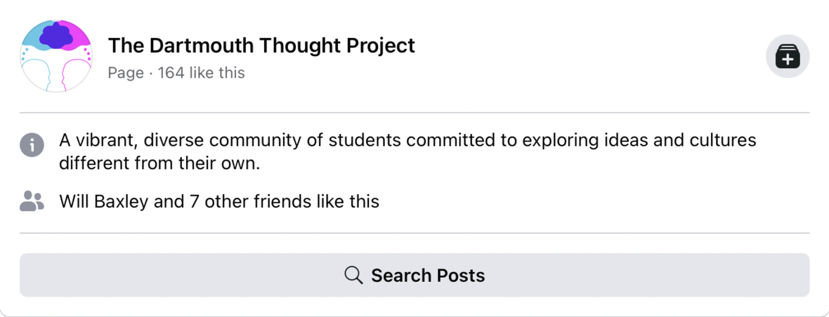
Thought Project's previous logo, is intuitive, representative, and comprehensive—ideologically capturing the purpose of the organization. Nevertheless, it can be improved quite a bit. As is, the logo is too complex, fairly dated, and not versatile. It does not scale well for different purposes, most importantly social media icons, and is not visually appealing, especially on clothing, stickers, or other distributable merchandise (two important avenues for expanding and revitalizing). Moreover, it fails to present clearly in black and white. Some lines are too thin, the design is relatively intricate, text is too small, and the thought bubble designs heavily rely on the use of color to distinguish them. This makes visibility and memorability quite difficult, especially in cases where the logo is obstructed or confined to small spaces, such as on Facebook or Instagram as shown.
Inspiration


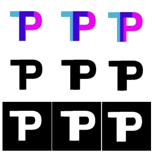
As an open community where diverse thoughts and people come together to develop better understandings of the world, Thought Project is characterized as a colorful environment. The organization's old logo embodies this reality as it features cyan- and magenta-colored thought bubbles merging to form a deep purple intersection. Fortunately, this avenue provided me with a means of maintaining some of the old Thought Project identity within the new logo, while being sure to create a distinct, fresh identity. I was inspired by modern logos like those shown above, which employ transparency to combine colors. The result is clean, vibrant, and simple.
Ideation
Idea 1


Initially, I attempted to take an advantage of Dartmouth's own recent rebranding, building off of that new identity by applying the Dartmouth logo's design concept to the Thought Project's. Maintaining the same colors of the Thought Project, I attempted to use thought bubbles to form the letter "D." This idea developed into an effort to form the "D" with the silhouette of a brain, perhaps ambigously shaped in order to simultanesouly represent a thought bubble. Though, both concepts worked to an extent, I did not think they were distinctive enough. The brain concept was well . . . too brainy, perhaps more fit for a neuroscience organization while I didn't like the shape of the thought bubble too much. Rather than play around with the bubble's shape, I decided to move on. Part of the worry revolved around associating our new identity with a logo that was resented upon its introduction, not too long prior.
Idea 2


My second idea was to incorporate the aforementioned transparency idea while also merging the letters spelling out "Thought Project." This proved either too complex, as in the case of the first concept above, or not identifiable enough, as the latter two concepts.
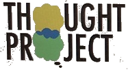
Product
Logo
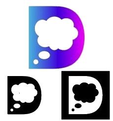
The result is a modern, simple, sleek, and strong logo which creates a defined brand experience that is both distinctive and consistent across varied applications—different colors, black or white, small or large, forwards or even mirrored. It is a symbol which is aesthetically pleasing and looks good as a sticker, on a shirt, on stationary, and in many different use-cases. The logo and its associted imagery maintain a friendly and welcoming aura. meant to capture the essence, values, and desired qualities of the Thought Project community as a shared space for constructive discussion. This is all while holding on to much of the defining character of the previous logo, allowing people easily make the transition from one logo to the other with an air of familiarity.
Color Scheme
Maintaining the same family of colors within the logo (light blue/cyan, light pruple/magenta, and a deep purple) creates continuity by preserving identity, character, and design language. The specific hues selected add a vibrancy and friendliness to the logo, filled with a sense of playfullness without the punch that often comes with colors that are "on your face." The combining of colors, this time visibly more transparent, again conveyed the merging of thoughts.
The addition of a muted yellow and a bright green as secondary colors allows for alternative color schemes (discussed further below) as well as a comprehensive and unified design language that can accomadate accents and complements in distributed media.
Applications
Color Scheme (not recommended)

Correspondence, advertising, and posters may incorporate the brand's characteristic thought bubbles as bullet point icons expemplified in the description of the color scheme.
Though it is best practice to remain within the confines of the provided color scheme, different color combinations can be used for certain events, festivities, etc. as long as colors are selected to logically combine and fit into the vibrant and playful, yet muted, feel of the selected color scheme (e.g. thought bubbles might be yellow and red, combining into orange for halloween or a fall themed event).
For the sake of social media icons, many of which force selected images to be small yet discernable, the thought-bubble shaped 'O's from the full logo may be used as a symbol of the Thought Project. This iconography, the most notable portion of the full logo, is sufficiently strong enough to present the group's image/brand on its own. With the added possibility of alternative seasonal/thematic color schemes or varied backgrounds, there is flexibility alognside the continuity of such branding. For the sake of these smaller images, the two small dots leading into the thought bubbles may even be discarded.
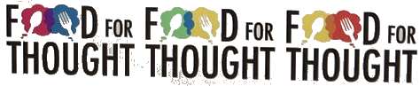
An example of the Thought Project bubbles' potential in alternate iconagraphy includes branding for marquee Thought Project events, such as Food for Thought Dinners as shown. This may be combined with alternative color schemes to give each kind of programming its own feel that remains related to that of the larger organization. Note the inclusin of the spoon and the fork in the icon, able to be merged to form a spork, even though this convolved result is not shown.